VISUALIZATION.md 2.0 KB
Viewing Performance Stats on Grafana
Using Texas Technical University data visualization lab, data polled from iDRAC and Slurm can be processed to generate live graphs. These Graphs can be accessed on the Grafana UI.
Once control_plane.yml is executed and Grafana is set up, use telemetry.yml to initiate the Graphs. Data polled via Slurm and iDRAC is streamed into internal databases. This data is processed to create the 4 graphs listed below.
Note: This feature only works on Nodes using iDRACs with a datacenter license running a minimum firmware of 4.0.
All your data in a glance
Using the following graphs, data can be visualized to gather correlational information.
Note: The timestamps used for the time metric are based on the
timezoneset incontrol_plane/input_params/base_vars.yml. In the event of a mismatch between the timezone on the browser being used to access Grafana UI and the timezone inbase_vars.yml, the time range being used to filter information on the Grafana UI will have to be adjusted per the timezone inbase_vars.yml.
The Multi-factor Visualization Dashboard
The Multi-factor Visualization Dashboard has 4 interactive visualization panels that allow you to see all the graphs mentioned above in a single view.
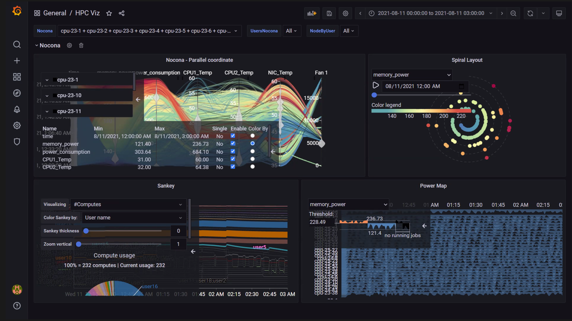
Using the Node and User dropdowns on the left, nodes and users can be filtered to collect data within a given time-frame (Select the time frame on the top-right of the view).

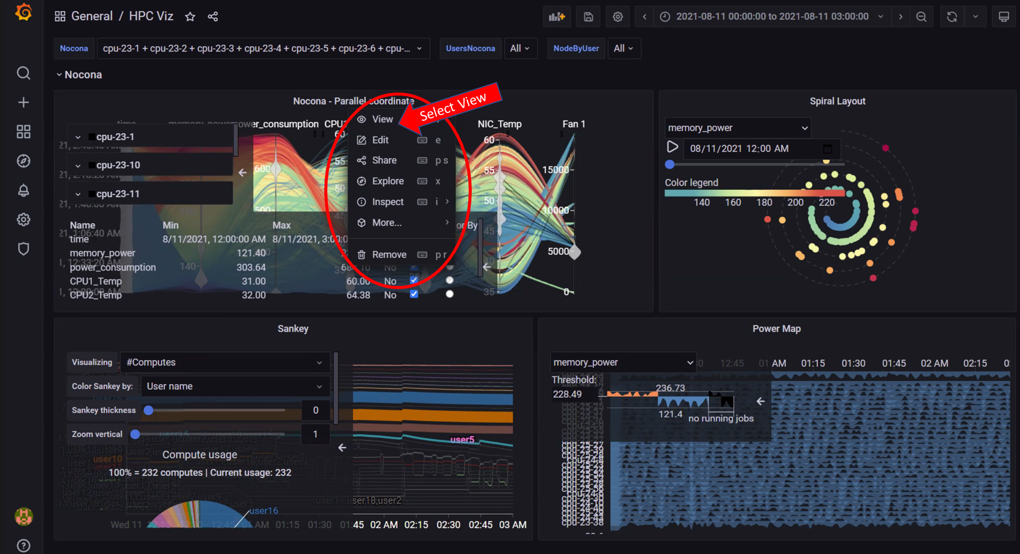
To interact with a specific panel, click on the Panel Name and then select the View option from the dropdown menu.