TELEMETRY.md 2.1 KB
Viewing Performance Stats on Grafana
Using Texas Technical University data visualization lab, data polled from iDRAC and Slurm can be processed to generate live graphs. These Graphs can be accessed on the Grafana UI.
Once control_plane.yml is executed and Grafana is set up, use telemetry.yml to initiate the Graphs. Data polled via Slurm and iDRAC is streamed into internal databases. This data is processed to create the 4 graphs listed below.
Note: This feature only works on Nodes using iDRACs with a datacenter license running a minimum firmware of 4.0.
All your data in a glance
Using the following graphs, data can be visualized to gather correlational information.
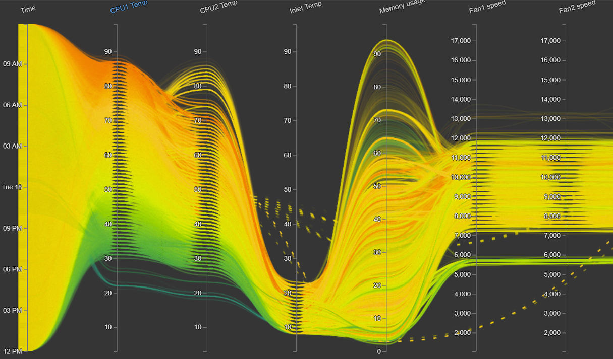
- Parallel Coordinates
Parallel coordinates are a great way to capture a systems status. It shows all ranges of individual metrics like CPU temp, Fan Speed, Memory Usage etc. The graph can be narrowed by time or metric ranges to get specific correlations such as CPU Temp vs Fan Speed etc.
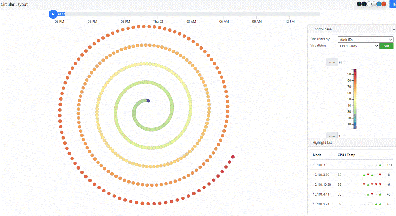
- Spiral Layout
Spiral Layouts are best for viewing the change in a single metric over time. It is often used to check trends in metrics over a business day. Data visualized in this graph can be sorted using other metrics like Job IDs etc to understand the pattern of utilization on your devices.
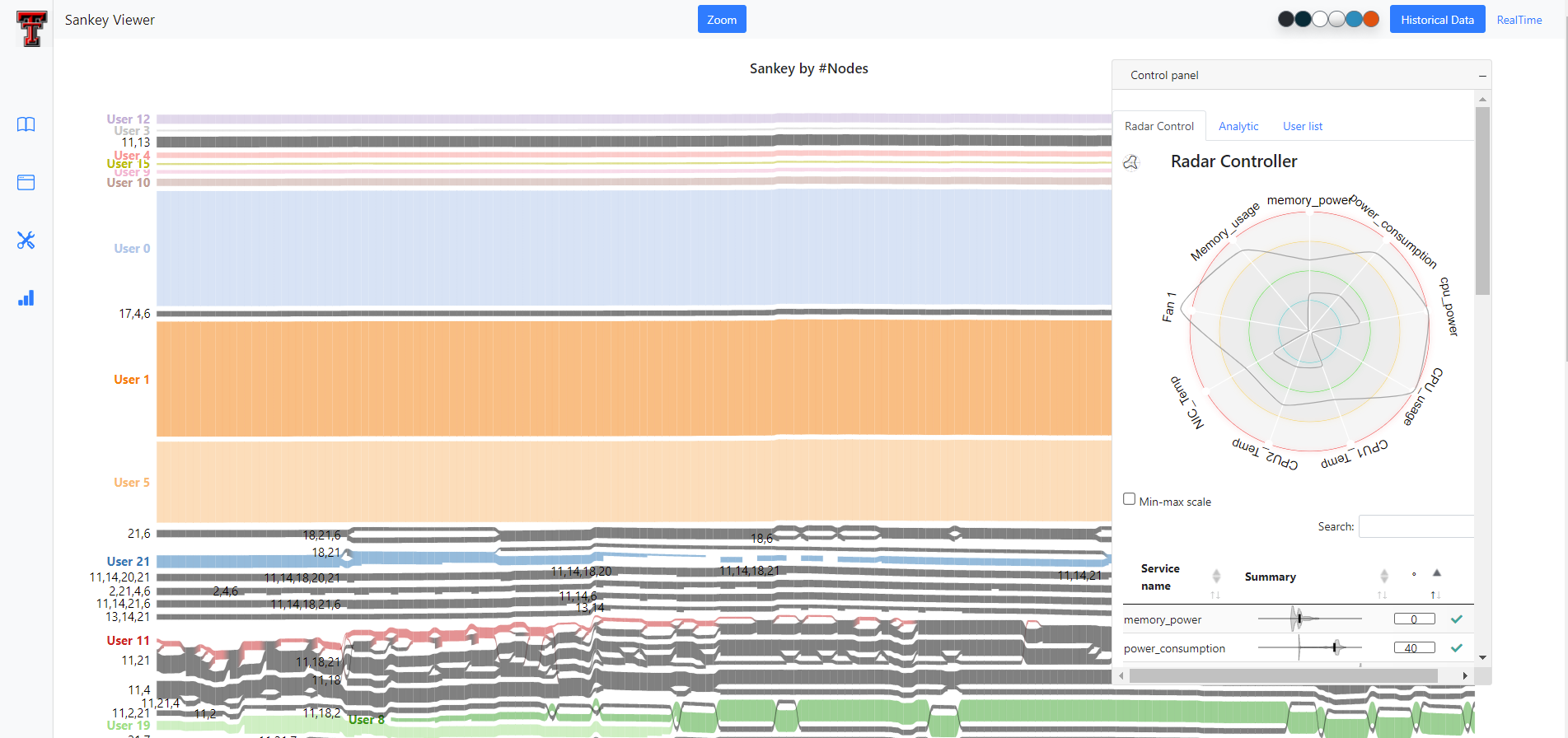
- Sankey Viewer
Sankey Viewers are perfect for viewing utilization by nodes/users/jobs. It provides point in time information for quick troubleshooting.
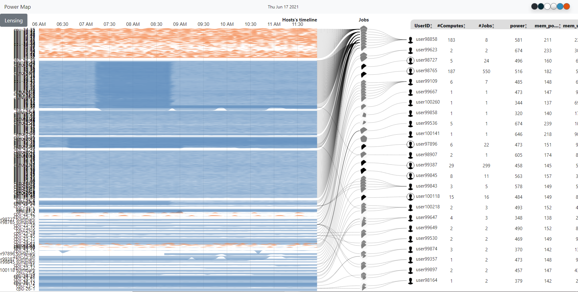
- Power Map
Power Maps are an excellent way to see utilization along the axis of time for different nodes/users/jobs. Hovering over the graph allows the user to narrow down information by Job/User or Node.